UXCPS
Simplifying complexity
What they needed
IT services company UXCPS needed a refreshed identity that better reflected their unique approach to IT — that, they are about people, not machines, that they were geeks but the smart personable kind and, definitely not the Donald Duck tie-wearing types. They also wanted an identity that reflected their unparalleled successes appealing to customers and recruits alike.
What we did
Brand positioning, Identity refresh, tone of voice, business cards, event banners, branded collateral, internal comms, website
How we did it
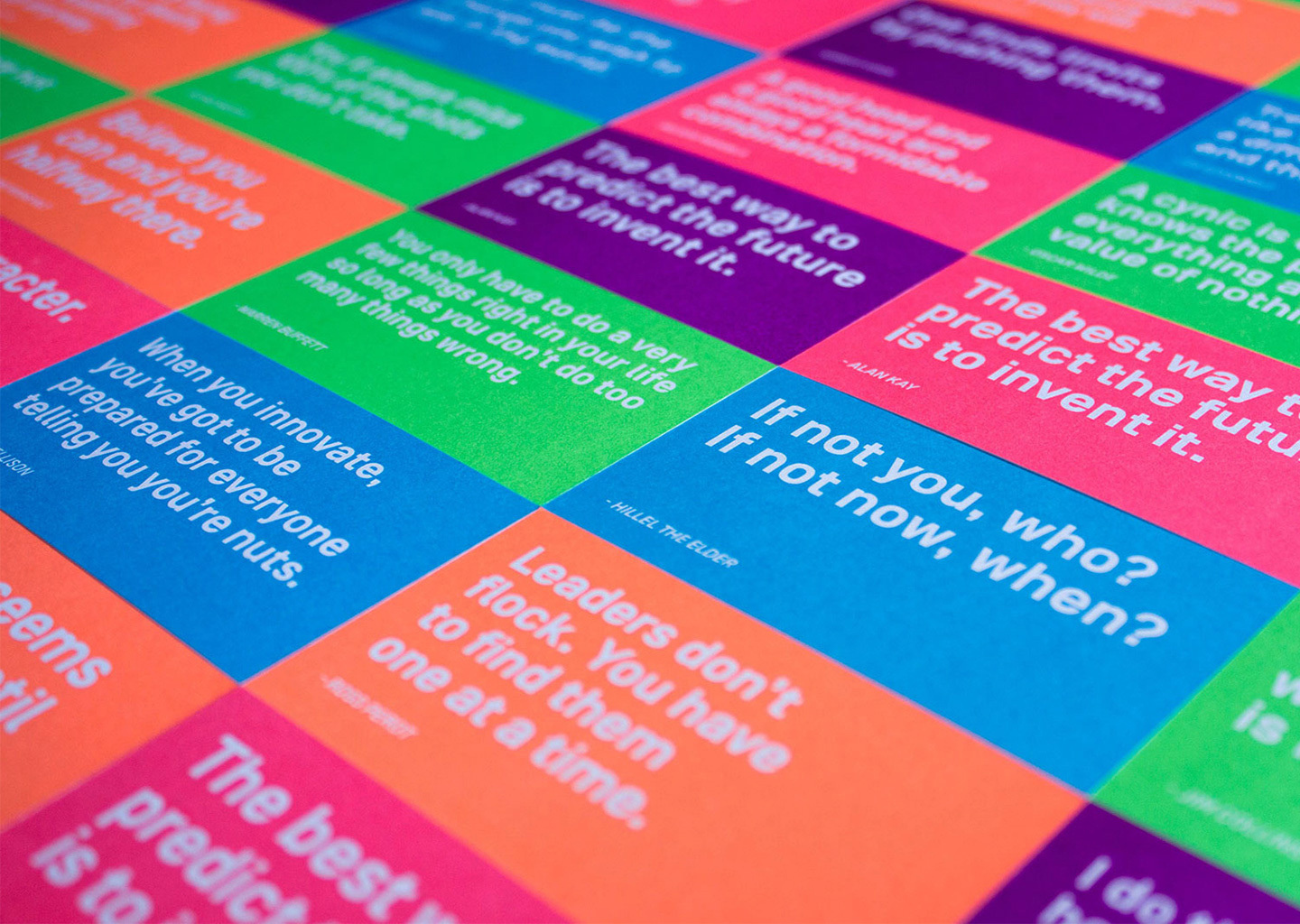
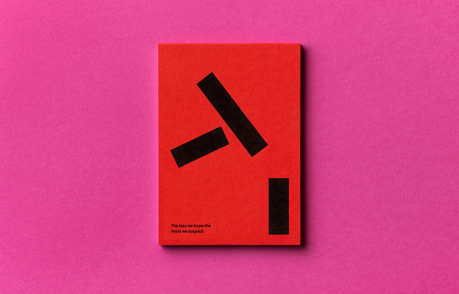
The new positioning was built around the way they help clients simplify complexity and see the unseen to deliver measurable results in a personal way — we used this thinking to break away from the usual ‘IT’ visual cues to stand out and better reflect their business. We activated the brand using unique colours to represent what each individual brings to the organisation, and aphorisms to reflect their unique role and personality. Every touchpoint we developed was designed to engage and highlight the business's successes in a straight walking way.
What they said
“Wink have been instrumental in taking our brand to the next level. We originally went to them for some website concepts, but what we got back was so much more. They’ve been instrumental in taking our brand to the next level. They took the time to ask us questions about our business and where we’re headed. Wink now know our business so well we see them as a partner, not just another supplier.”